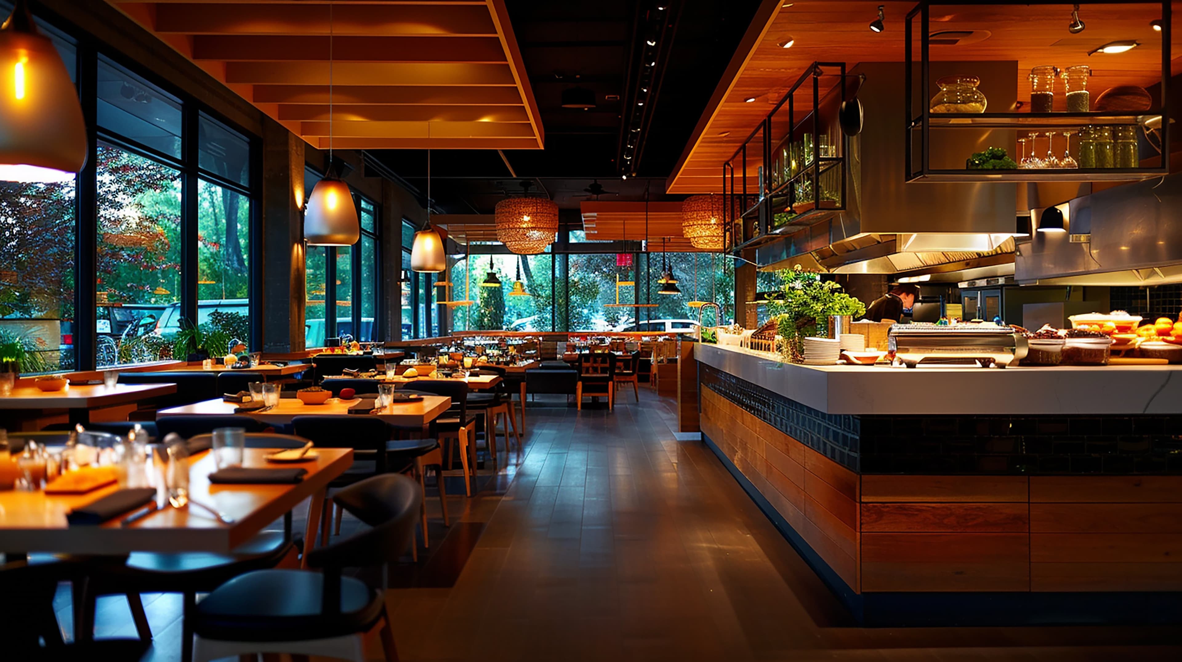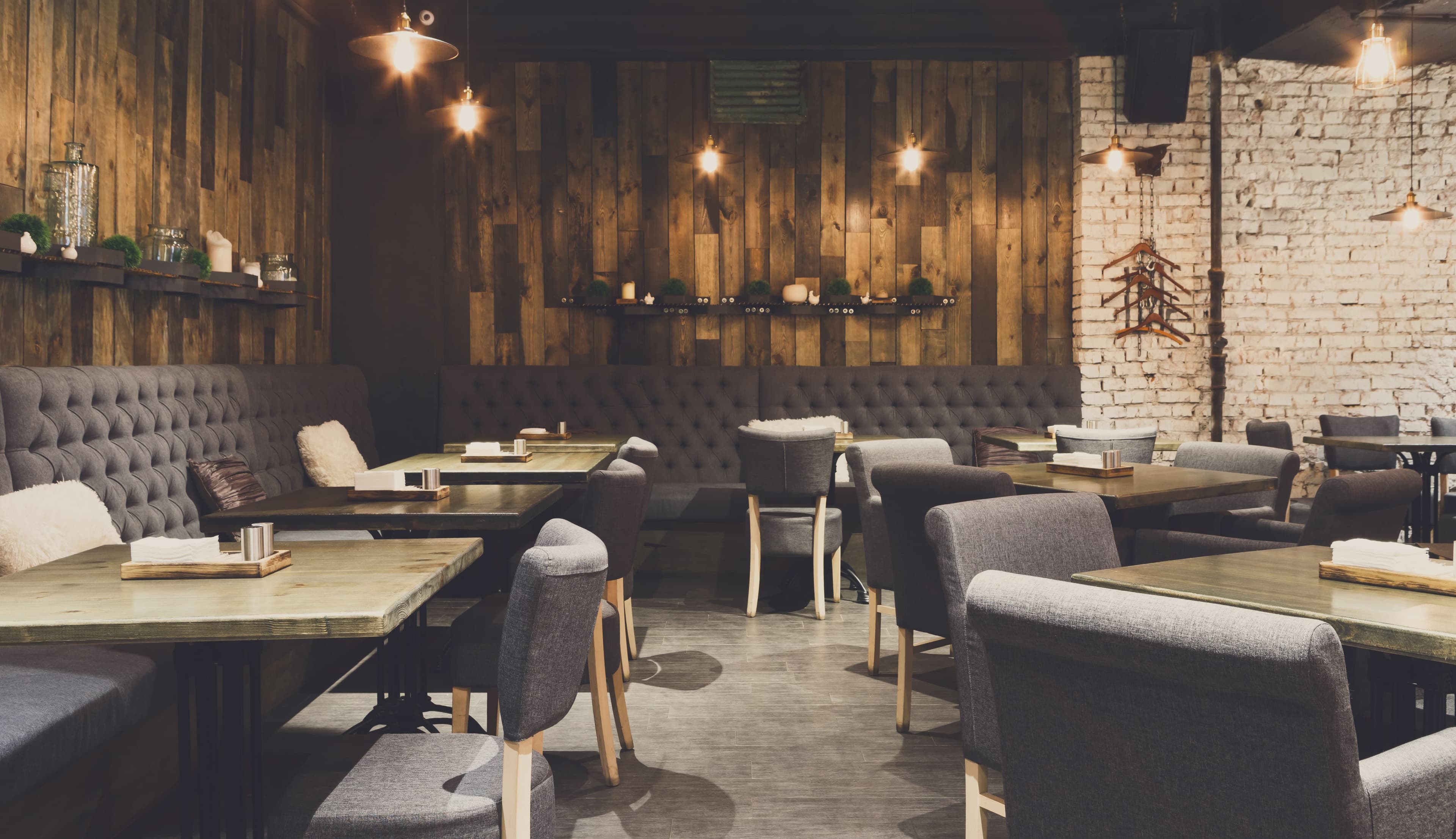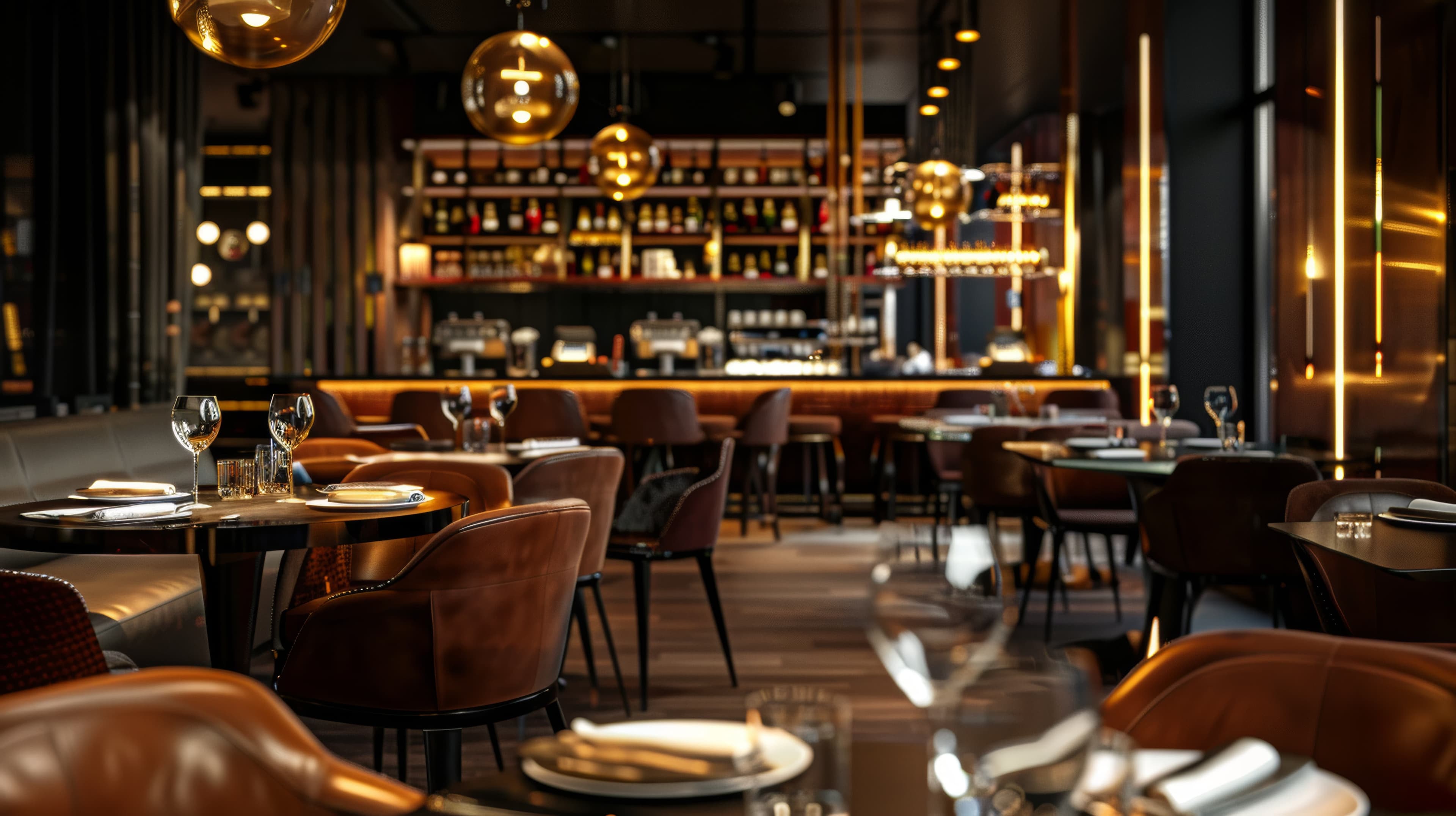
A living reference for every design token, component pattern, and asset in the Reno Restaurant Guide design system. If a pattern ships in the site, it lives here.
Section 01
Colors
All brand, surface, and status colors live as CSS custom properties. Prefer var() over hardcoded values everywhere in the app.
Brand
--accent
Warm bronze, main brand
--accent-hover
Accent hover state
--secondary
Deep amber bronze, secondary brand
--secondary-hover
Secondary hover state
Accent alpha ladder
--accent-t90
alpha 0.90
--accent-t75
alpha 0.75
--accent-t60
alpha 0.60
--accent-t40
alpha 0.40
--accent-t20
alpha 0.20
--accent-t10
alpha 0.10
Accent lightness ladder
--accent-50
50 (lightest)
--accent-100
100
--accent-200
200 (+30% L)
--accent-300
300 (+20% L)
--accent-400
400 (+10% L)
--accent-500
500 (base)
--accent-600
600 (-10% L)
--accent-700
700 (-20% L)
--accent-800
800 (-30% L)
--accent-900
900 (deepest)
Theme-swapped tokens
These tokens resolve to different values in dark vs. light mode. Each swatch renders both halves side by side.
Dark
Light
--background
Page background
Dark
Light
--surface
Elevated surface layer
Dark
Light
--surface-raised
Higher elevation (cards, inputs)
Dark
Light
--border-default
Standard border color
Dark
Light
--text-body
Primary text color
Dark
Light
--text-body-muted
Secondary text color
Dark
Light
--text-body-subtle
Muted/meta text color
Dark
Light
--neutral-bg
Deepest background (internal neutral)
Dark
Light
--neutral-surface
Surface foundation (internal neutral)
Dark
Light
--neutral-text
Text foundation (internal neutral)
Surface and chrome tokens
Dark
Light
--header-bg
Site header background (unscrolled)
Dark
Light
--header-bg-scrolled
Site header background (scrolled)
Dark
Light
--drawer-bg
Mobile drawer background
Dark
Light
--icon-bg
Icon chip background
Dark
Light
--border-subtle-accent
Brand-tinted border
Dark
Light
--divider-subtle
Subtle divider hairline
Dark
Light
--glow-bg
Glow/halo background tint
Dark
Light
--hover-overlay
Generic hover wash
Dark
Light
--nav-link
Nav link foreground
Dark
Light
--footer-link
Footer link foreground
Dark
Light
--meta-text
Legal / meta text color
Status
--success
Open now, confirmed, positive
--success-light
Lighter success variant. Used in pulse animation rings and success-state highlights.
--success-hover
Success hover
--warning
Caution, pending
--warning-hover
Warning hover
--error
Closed, error, destructive
--error-hover
Error hover
Section 02
Typography
Two families. Playfair Display for editorial headings, Inter for everything else. All sizes use a 10px base (62.5% root font-size), so 1.6rem = 16px.
The spacing ladder is 1, 2, 3, 4, 6, 8, 12, 16 in rem at 62.5% root. Use --space-* custom properties for consistency, or Tailwind arbitrary values where the token isn't mapped to a utility.
--space-1
0.25rem · 2.5px
--space-2
0.5rem · 5px
--space-3
0.75rem · 7.5px
--space-4
1rem · 10px
--space-6
1.5rem · 15px
--space-8
2rem · 20px
--space-12
3rem · 30px
--space-16
4rem · 40px
Section 04
Border Radius
Four radius tokens cover every rounded surface in the app. Use var(--radius-*) for consistency.
--radius-sm
0.375rem
--radius-md
0.625rem
--radius-lg
1rem
--radius-xl
1.5rem
Section 05
Buttons
The Button component supports variants primary, secondary, ghost, danger and sizes sm, md, lg. Primary and danger buttons include a subtle hover shimmer animation. Pass disabled as a standard HTML attribute.
variant=primary
variant=secondary
variant=ghost
variant=danger
disabled
isLoading
Section 06
Dividers
DiamondDivider is the canonical section separator: two fading bronze hairlines with a rotated square at center. All visual properties are prop-driven.
Bronze-to-amber bar, 2px, transparent → --primary → --tertiary → transparent
Section 07
Badges and Tags
Badge component not yet built; these are static previews demonstrating the intended visual treatments.
FeaturedPublishedActiveErrorPending
Section 08
Tier Badges
Tier badges identify a listing's subscription tier at a glance. Visual weight scales with tier: Essential uses a neutral outline, Showcase fills in bronze, and Premier adds a soft glow to reinforce premium placement. Labels pull from siteConfig.tiers so any rename propagates automatically.
Default size
EssentialShowcasePremier
Small size
EssentialShowcasePremier
On a listing card
Example Listing Name
Downtown Reno · Italian
Premier
Section 09
Status Pills
Status pills communicate whether a listing is currently open or closed. Rendered on listing cards in the directory grid and on the listing detail page. The isOpen value is cached on each listing by the 15-minute Inngest cron.
Default size
OpenClosed
Small size
OpenClosed
On a photo surface
Open
Section 10
Toggle Pills
Rounded pill-shaped toggle buttons for single binary filters like Open Now. Inactive uses an outline treatment; active fills with primary bronze. Accepts an optional icon slot. In the directory, a filled green dot reinforces the open-status semantic.
With icon
Without icon
Section 11
Facet Groups
Collapsible group of checkbox filters. Header toggles expand/collapse. When the term list is longer than initialVisibleCount (default 7), a Show all (N) link reveals the rest. Each FacetCheckbox reads its active state from the URL searchParams.
Section 12
Listing Card
The directory card. Used in the directory grid and other listing surfaces. Hover the card to see the full choreography: image zoom, darken overlay, shimmer divider, arrow reveal, border lift, and shadow.
Dry-aged cuts seared over an oak-fired hearth and finished with house compound butters, alongside a short list of reserve pours behind the bar. The room leans dark wood and brass with a low-lit booth section built for long dinners. Service is unhurried and attentive without the steakhouse formality.
River-side coffee bar pouring single-origin espresso and pour-overs alongside a seasonal menu of house-baked pastries and small plates. Tucked along the Truckee with patio seating when the weather holds. Regulars come for the morning rush and linger through lunch.
All-day breakfast built around local eggs, house biscuits, and a griddle that never cools down. The patio opens by 8 and stays full through the shoulder hours. Espresso program anchored by a small-lot roaster out of Truckee, plus a short cocktail menu for brunch drinkers.
BreakfastBrunchOutdoor Seating
Price
Casual Eats
Hours
Open until 2 PM
Loading state
Use ListingCardPlaceholder for skeleton states during data loads. Matches card zones so the real card can slot in without layout shift.
Section 13
CardsWork in Progress
Card patterns for directory listings, featured content, and info blocks. Component not yet built; these are layout previews.
Default
Listing Title
Brief descriptive copy about the restaurant or bar.
Elevated
Featured Card
Higher surface + soft shadow for emphasis.
Accent
Promo Card
Bronze wash + bronze border for callouts.
Section 14
Forms
Reusable primitives for every public form on the site. Input, Textarea, and Select share a single visual contract: 1.5px border, bronze focus state with a 3px ring, error variant in red, soft hover warm-up. Wrap any of them in FormField to attach a label, helper text, and error messaging. SegmentedControl handles two-or-more option choices.
Input states
Idle
Filled
Hover (move mouse over)
Focus (click into the field)
Error
Enter a valid email address.
Disabled
Textarea
A short paragraph is fine. We polish copy before publishing.
Select
Segmented control
value = owner
FormField composition
We use this to send your member receipt.
Phone number is required.
Section 15
Dark Sections
Dark section bands create visual rhythm by punctuating the page with always-dark content regardless of the active theme. Use for hero moments, CTAs, and stat rows.
Always Dark
Find your next favorite table in Reno.
Dark bands anchor the page rhythm and work well for statistics, testimonials, and hero moments.
240+
Restaurants & bars
12
Neighborhoods covered
2026
Established
Apply data-theme="dark" to any section that should render dark regardless of the active theme.
Section 16
Iconography
Icons use Lucide React. Install: npm install lucide-react. Import: import { IconName } from 'lucide-react'.
ArrowRight
ArrowUpRight
ArrowLeft
Check
ChevronDown
ChevronUp
ChevronRight
ChevronLeft
Menu
X
Search
Mail
Phone
MapPin
Calendar
Clock
Star
TrendingUp
BarChart2
Building2
Home
ExternalLink
Download
Upload
Sun
Moon
Settings
Plus
Minus
Edit
Trash2
Eye
EyeOff
Lock
Unlock
AlertCircle
Info
CheckCircle
XCircle
Shield
LayoutDashboard
LogOut
Loader2
Heart
Copyright
UtensilsCrossed
Wine
ImageIcon
Share2
ShoppingBag
Size demonstration
size=16
size=20
size=24
size=32
Section 17
Pagination
Used on paginated listing grids (directory, search results). Shows previous/next controls, numbered page buttons with active state, and ellipsis truncation when total pages exceed the window size. Window size is configurable via siteConfig.pagination.paginationWindowSize.